
What are Sparklines?
Sparklines are miniature charts that are heavily simplified and typically fit into a line of text or a cell on a spreadsheet. Their first appearances date back to 18th century chivalric novels and the display of barometric signatures of the notorious 19th century Krakatoa eruption. Unlike classic charts, Sparklines are meant to be succinct and located right where they are discussed. Microsoft’s XLSX format has included these mini-charts for quite some time. With the major release of Collabora Office 22.05, Sparklines became available within the LibreOffice technology ecosystem. Shortly afterwards, they were also implemented in Collabora Online 22.05 and LibreOffice 7.4.
Creating Sparklines in Collabora Online
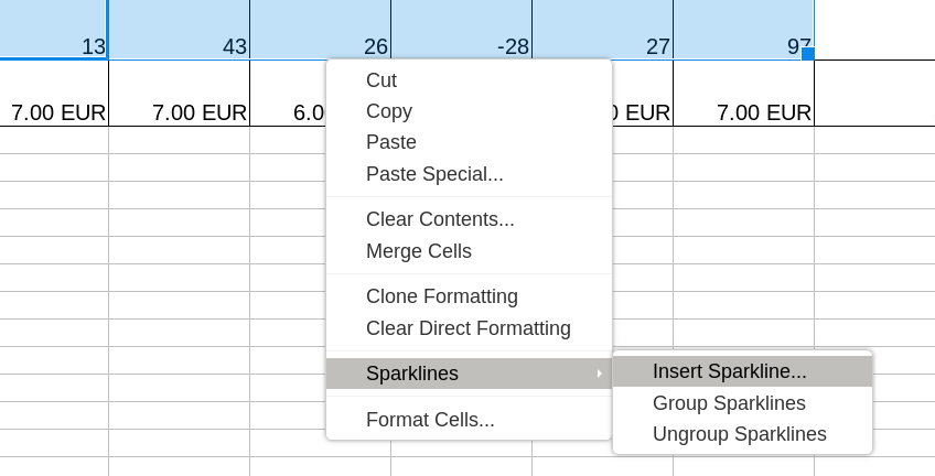
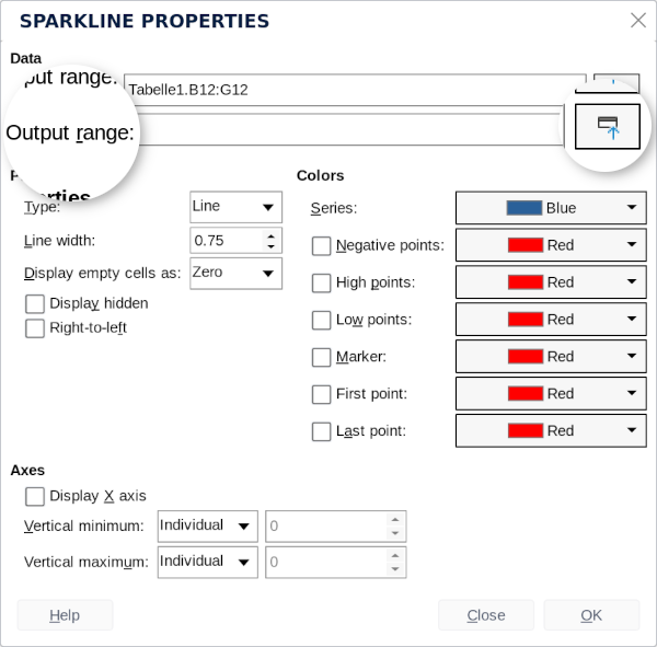
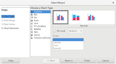
If you open a .XLSX or .ODS spreadsheet including Sparklines inside Collabora Online, the miniature charts will be preserved. If you want to create a new Sparklines chart from scratch in Collabora Online, you should start by selecting the row or column of cells you would like to visualize. Right-click, and chose “Sparklines > Insert Sparklines…” from the context menu. The “Sparklines Properties” dialog will appear including the chosen input range. The button besides the “Output range” field allows you to choose the cell the Sparkline will be created in.
Formatting Sparklines in Collabora Online
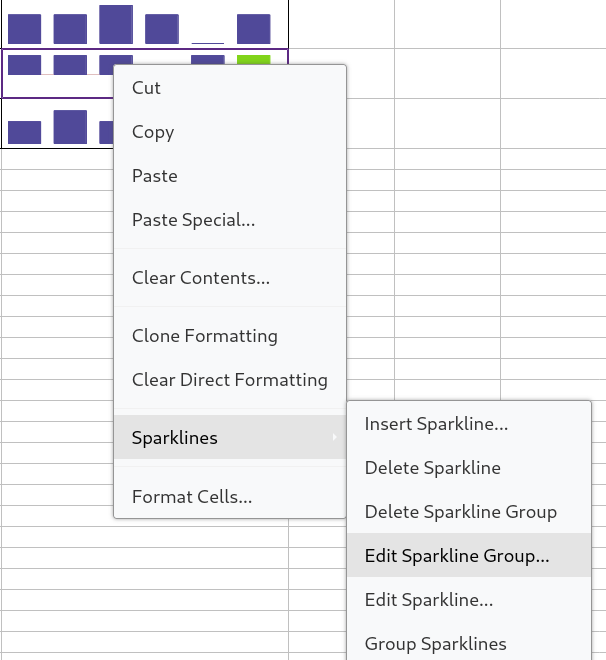
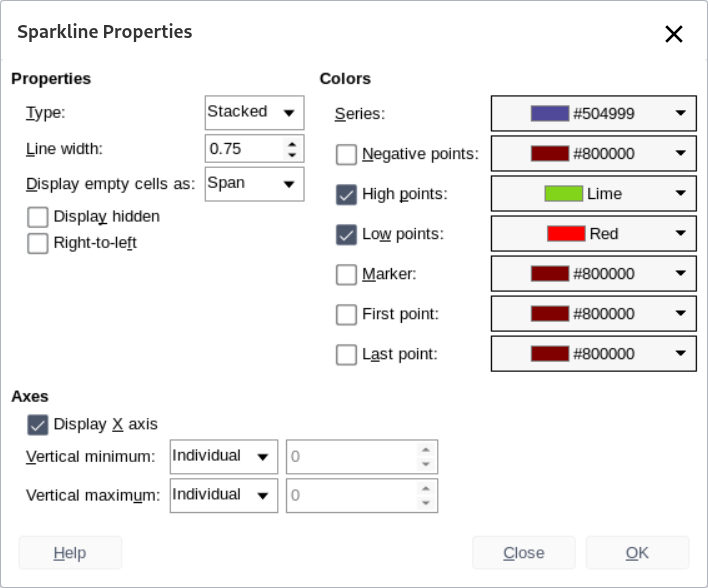
If you would like to edit or customise the appearance of a group of mini charts, right-click on the Sparklines and chose “Edit Sparkline Group…”. This will summon the “Sparkline Properties” dialog and grant access to several different settings. You can for instance choose between three different types of Sparklines. Just like Office 365, Collabora Online allows you to create a miniature Line Chart, a Column Chart or a Stacked Chart (Win/Loss). You can also customise the visual appearance by adjusting the line width or choosing individual colours for special points in the graph (marker, high/low point, first/last point).
Test this in Collabora Online or CODE
The Sparkline feature has been introduced to Collabora Online with the major release 22.05. You can test the feature in our free demo. Tech enthusiasts may also like to test it inside an installation of CODE, the free Collabora Online Development Edition, intended for home users and Developers who would like to help to test the bleeding-edge features first. Find all the instructions here.
Thank you for making this possible
This feature was made possible by funding from NGI and the European Union’s Horizon 2020 research and innovation programme under grant agreement No 871498. For more information on the technical background, see Tomaz Vajngerl’s blog.
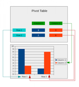 Pivot tables are a powerful tool to reorganise, manipulate and summarise the data set in spreadsheets to get the valuable information from it. To get a quick visual representation of the information, pivot charts can be used. A pivot chart can be created from the output of the pivot tables, and if the pivot table gets changed, so does the pivot chart.